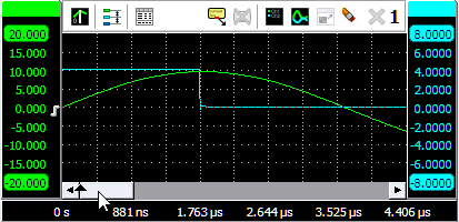
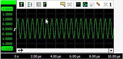
The Multi Channel oscilloscope software allows you to create and arrange graphs the way you want. New graphs can be created on the main screen of the measurement software and can be moved to a separate window outside the main screen. When a new graph is created, the user can fully control the position of the graph, as well as the size. By arranging the graphs to the user's liking, the user can focus more on the measurements at hand, rather than having to locate the graph with the desired information all the time. The graphs can contain scope images, spectrum analyzer images and data logger images.
Read here to learn how to display data in a graph.
Contents
- 1 Create a new graph
- 1.1 Active graph
- 2 Axes
- 3 Vertical Axes
- 3.1 Tabbing axes
- 3.2 Adjusting displayed signals using an axis
- 3.3 Show or hide a line
- 3.4 Automatically arranging axes
- 3.5 Merging axes
- 3.6 Axis type
- 3.7 Axis range
- 3.8 Visible range
- 3.9 Clipping detection
- 3.10 Show peaks and harmonics
- 3.10.1 Properties
- 3.10.2 Mark peaks
- 3.10.3 Mark harmonics
- 4 Horizontal Axis
- 4.1 Axis range
- 4.2 Visible range
- 4.3 Follow source
- 4.4 Axis type
- 4.5 Time axis label style
- 5 Toolbar
- 6 Zooming
- 7 Drawing options
- 7.1 Interpolation
- 7.2 Visual noise reduction
- 7.3 Show t=0
- 7.4 Legend
- 7.5 Markers
- 8 Automatic measurements using the cursors
- 8.1 Measurements
- 8.2 Phase cursors
- 8.2.1 Phase cursor settings
- 9 Reference signals
- 10 Using comments
- 11 Exporting graph data
- 12 Saving Graphs
Create a new graph
By default, the Multi Channel oscilloscope software opens with one graph.
Creating additional graphs can easily be done by using the Create new graph quick
function  .
.
A second way is right-clicking on the graph area and select Make new graph. Then drag a rectangle at the position where you like to have a new graph. The rectangle may be dragged over multiple existing graphs.
Active graph
When more than one graph is available, one graph becomes the active graph, indicated by a blue border around the graph. Instruments, channels, sources and I/Os have actions that will add a line for that object in the active graph. The File menu contains an option to save the active graph as image.
Selecting a graph as active graph is done by clicking that graph with the mouse or by using hotkey Shift + graph number.
Axes
When a graph displays a signal, it has a horizontal axis or scale to indicate time or frequency information for that signal. It will also have a vertical axis or scale to indicate signal magnitude information. Each axis has text labels aligned with the grid lines of the graph, showing the corresponding magnitude, time or frequency value for that grid position. The range of the axis automatically adapts to the range of the signal data it belongs to.
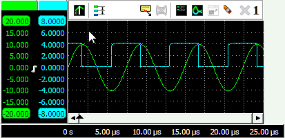
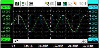
When multiple signals are displayed, each signal will get its own vertical axis, the graph will have one horizontal axis that matches with the combined time or frequency ranges of all signals.
Vertical Axes
A graph gets one vertical axis per displayed signal. This axis is divided in 8 divisions and gives information on the magnitude of the displayed signal and allows to control how and where the signal is displayed.
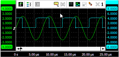
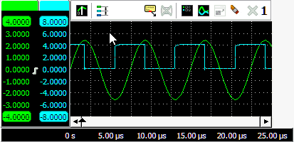
The axis can be located at the left hand side of the graph and at the right hand side of the graph. Axes of automatically added signals, e.g. when enabling a channel, will be placed at the left or right hand side, depending on the channel number of the instrument. Axes of manually added signals will be placed at the same side of the graph as where the signal source was dropped. To change the location of an axis, use the mouse to grab it at it colored tab and drag it to the other side of the graph, see animation 1 for an example. In the same way, an axis and its corresponding signal can also be moved to another graph. When keeping the Ctrl key pressed while moving an axis to another graph, the axis and its signal will be copied to the other graph.
Tabbing axes
When multiple signals are displayed, e.g. with large combined instruments, multiple axes will be added to the graph, taking up space, leaving less space for the actual signals. To reduce the space occupied by the axes, they can be tabbed. Right click the colored tab of one of the axes and check Tabbed in its popup menu. All axes at that side of the graph will now be placed on a tab. To untab them again, right click the colored tab of one of the axes and uncheck Tabbed in its popup menu.
When the axes are tabbed, only the axis on the selected tab will be visible and can be used to position and resize the corresponding signal. To select another axis, click the tab of that axis, which will bring it to the front. That axis can now be controlled and its corresponding signal can be adjusted. Signals of tabbed axes can have different ranges, positions and sizes.
Adjusting displayed signals using an axis
The size and position of a displayed signal can be adjusted using the corresponding axis.
To change the position of a signal, simply grab the corresponding axis and drag it to the required position, see animation 3 for an example. Use this to align signals to each other or to align them with grid lines.
To change the size of a shown signal, grab one of the end bars of the corresponding axis and drag it to the preferred position, see animation 4 for an example. Use this to zoom in or out vertically on a signal.
It is also possible to adjust the position and size with the mouse wheel: when the mouse pointer is above the axis and the wheel is turned, the position is adjusted. When the Ctrl key is pressed during the turning of the wheel, the size is adjusted instead.
Changing the position or the size of a displayed signal modifies the Visible range of an axis.
Show or hide a line
When a graph shows multiple signal lines, it may be convenient to temporarily hide one or more lines, for a better view on the other signal lines. When a signal is hidden from the graph, it remains being measured and all other settings remain unchanged. Right click the corresponding axis and select Line visible from the popup menu to toggle the visibility of the signal line.
Lines that are hidden are ignored when the graph is exported to a file.
When performing a streaming measurement with a high sample rate, hiding lines during the measurement will reduce the load on the computer. This may reduce the chance that the computer cannot keep up with the data stream, causing the stream to be aborted. When the measurement is ready, the line(s) can be made visible again, for signal analysis.
Automatically arranging axes
When multiple signals are displayed in a graph, they can be arranged such that signals do not overlap.
The  Arrange axes button on the graph toolbar and the option Arrange axes in the graph's popup menu
give the following modes:
Arrange axes button on the graph toolbar and the option Arrange axes in the graph's popup menu
give the following modes:
| Action | Description |
|---|---|
| Off | The Arrange mode is switched off. Signals are shown as how the user positions them. When a signal is added, it will be shown 1:1, potentially overlapping other signals. |
| 1:1 | All axes are shown unzoomed |
| Automatic | Each axis uses a whole number of divisions and axes are positioned without overlap. Axes can get different zoom factors. |
| Automatic with overlap | Each axis uses a whole number of divisions and axes are positioned with overlap. Axes can get different zoom factors. |
| 1:N | All axes are evenly divided and they are positioned without overlap. All axes get the same zoom factor. |
| 1:N with overlap | All axes are evenly divided and they are positioned with 50% overlap. All axes get the same zoom factor. |
| 1:M | Each axis uses a whole number of divisions and axes are positioned without overlap. All axes get the same zoom factor. |
| 1:M with overlap | Each axis uses a whole number of divisions and axes are positioned with overlap. All axes get the same zoom factor. |
When a certain mode is selected and a line is added to the graph, all present signals will be repositioned according to the selected mode.
When a certain mode is selected the graph is zoomed in by dragging a rectangle with the mouse, pressing the
 Zoom reset button
will reset the original view corresponding to the selected mode.
Zoom reset button
will reset the original view corresponding to the selected mode.
When a mode is selected and the user then changes the position of one or more signals, the mode is switched to Off.
Merging axes
For easy comparison of two (or more) signals with the same unit, they can be placed on the same axis. When dragging one axis on another axis (see animation 5), the axes merge to a single axis. The colored tab of the axis will show the original colors of the merged axes. The range of the axis will be set to fit the ranges of the merged axes. All signals corresponding to the axis will be displayed using that axis. When changing position and/or scale, all corresponding signals will be adapted accordingly.
To extract a signal from a merged axis and give it its own axis again, right click the axis and select Extract line from the popup menu.
To delete a signal from a merged axis and no longer display it, right click the axis and select Delete line from the popup menu.
Axis type
A (vertical) axis can be set to two different types:
- Linear: The data of the axis is displayed on a linear scale.
-
Logarithmic: The data of the axis is displayed on a logarithmic scale.
- dB: calculates 20 * 10log(input value), 0 dB corresponds to 1 V
- dBV: is the voltage ratio, relative to 1 V.
- dBmV: is the voltage ratio, relative to 1 mV.
- dBµV: is the voltage ratio, relative to 1 µV.
- dBµV/m (at 10m): is the voltage level in decibels referenced to 1 microvolt per meter at 10 m distance.
- dBm: is the power ratio relative to 1 mW.
Setting the axis type can be done by right clicking the axis and selecting Axis type from the menu that pops up.
Axis range
An axis has a range that follows the range of the data it is connected to. If the axis is connected to e.g. a channel that is set to an input range of -4 V to 4 V, the range of the axis will be -4 to 4 V too. When the range of the data changes (e.g. the channel is set to another input range), the axis range automatically changes accordingly.
In certain situations it may be useful to force the axis to keep a specified range, other than the range of the data. By right-clicking the axis and selecting Set axis range a user defined axis range can be entered. A dialog appears in which a minimum and a maximum value can be entered. A Fixed checkbox, default checked, is also available to keep the axis fixed to the entered range. The axis will now remain in this fixed axis range, even if the range of the connected data changes.
To reset the axis range to follow the range of the data again, uncheck the Fixed check box. Now, when the range of the connected data changes, the axis range will follow the data range again.
Visible range
To adjust the size and position of a displayed signal, use the Visible range of an axis. The visible range of an axis has a maximum value and a minimum value that correspond to the top and the bottom of the axis. It defines which part of the axis range is visible in the graph. By setting the visible range smaller than the axis range, a signal is shown larger (zoom in vertically). By setting the visible range larger than the axis range, a signal is shown smaller (zoom out vertically).
When the visible range of an axis is adjusted and the range of the data changes, the visible range of the axis changes accordingly.
Clipping detection
When clipping detection is enabled in the settings, the software will place indicators in the graph and/or meter display when the signal is clipped due to being larger than the input range.
When the clipping appears within the visible part of the signal, the clipping indicator will be placed next to the location of the first occurrence of the signal clipping. The clipped signal parts will be drawn in a different color. Clipping at both ends of the input range will be indicated separately, two indicators will then be placed.
When clipping occurs outside the visible part of the signal, the indicator(s) will be placed at the edge of the graph, closest to the location where the clipping occurs.
Hovering an indicator with the mouse will show a hint with more information.
When the displayed signal is processed by one or more I/Os, it may be no longer possible to detect whether the signal is clipped or not. In that case no indicators are shown.
The color of the clipping indicator and the clipped signal parts can be determined in the settings.
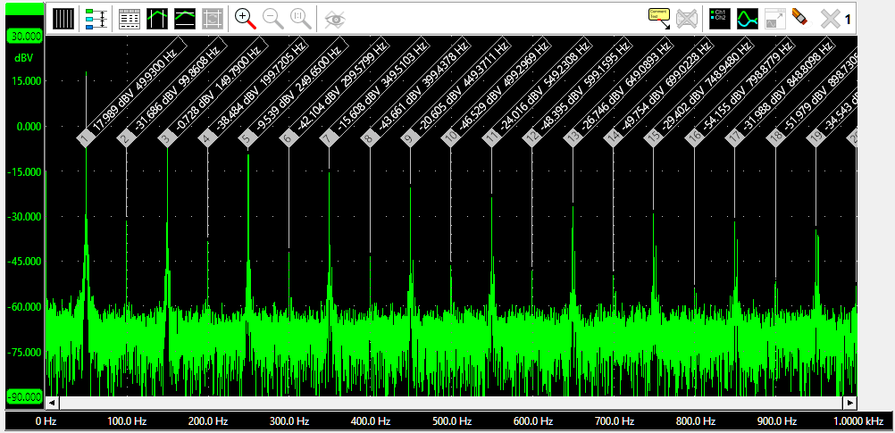
Show peaks and harmonics
Each signal line in a graph can show peaks in the signal by placing markers in the top part of the graph, with lines to the actual peak. The magnitude of the peak is shown in the marker, as well as a time stamp. When the graph displays frequency domain data, a frequency spectrum, it can also show the harmonics, with harmonics number, frequency and magnitude.
Right-clicking a marker allows you to copy all relevant information of that marker to the clipboard. It also allows you to copy all relevant information of all markers to the clipboard.
Properties
To control the behavior of the graph markers, several properties are available. These can be accessed through a popup menu which is shown when the axis in the graph is right clicked. The properties can also be accessed through the line settings window which is shown via the popup menu.

Mark peaks
Enabling Mark peaks will place markers at the peaks in the signal. Any peak in the signal above Peaks threshold will be considered a peak.
Mark harmonics
When the graph contains frequency domain data, a frequency spectrum, the option to show harmonics becomes available. Enabling Mark harmonics will place markers at the harmonics in the frequency spectrum. The maximum amount amount of harmonics that is marked can be set using Harmonics. When Even harmonics is enabled, both uneven and even harmonics are marked, otherwise only uneven harmonics are marked.
Horizontal Axis
A graph gets one horizontal axis, independent of how many signals are displayed. This axis is divided in 10 divisions and gives information on the time or frequency of the displayed signal. When time domain data is connected (in an oscilloscope), the horizontal axis represents time. When frequency domain data is connected (in a spectrum analyzer), the horizontal axis represents frequency. The range of the horizontal axis automatically follows the range of the data it is connected to. When multiple signals are displayed, the axis range is set such that the ranges of all connected signals fit. The horizontal axis is always located at the bottom of the graph.
The horizontal axis is equipped with a scrollbar. The width of the scroll bar represents the total measured record, the width of the slider represents the visible part of the record. To change the horizontal size of a signal (magnify / stretch it), drag one of the edges of the slider either to the left or the right and watch the signal change corresponding to the slider width (animation 6). To change the horizontal position of a signal, grab the slider and drag it to the preferred position (animation 7) or press the buttons at the sides of the scroll bar:
- clicking the button at the end of the scrollbar, will move the signal a half division
- clicking the background of the scrollbar, next to the slider, will move the signal 5 divisions
- clicking the button at the end of the scrollbar or the background of the scrollbar with the Ctrl pressed, will move the signal 10 divisions
It is also possible to adjust the size and position with the mouse wheel: when the mouse pointer is above the scroll bar and the wheel is turned, the horizontal position is adjusted. When the Ctrl key is pressed during the turning of the wheel, the horizontal size is adjusted instead.
Double-clicking the slider, clicking the Reset zoom button or pressing the hotkey T will return the horizontal
axis to its default unzoomed state.
When zoomed in, the graph can also be panned horizontally by dragging the signal left or right, with the right mouse button pressed.
Changing the position or the size of the displayed signal(s) modifies the Visible range of an axis.
Axis range
An axis has a range that follows the range of the data it is connected to. If the axis is connected to e.g. a channel that is set to a time base of 1 ms/div, starting at t = 0, the range of the axis will be 0 to 10 ms. When the range of the data changes (e.g. the scope is set to another time base setting), the axis range automatically changes accordingly.
In certain situations it may be useful to force the axis to keep a specified range, other than the range of the data. By right-clicking the axis and selecting Set axis range a user defined axis range can be entered. A dialog appears in which a minimum and a maximum value can be entered. A Fixed checkbox, default checked, is also available to keep the axis fixed to the entered range. The axis will now remain in this fixed axis range, even if the range of the connected data changes.
To reset the axis range to follow the range of the data again, uncheck the Fixed check box. Now, when the range of the connected data changes, the axis range will follow the data range again.
Visible range
To adjust the horizontal size and position of a displayed signal, use the Visible range of an axis. The visible range of an axis has a maximum value and a minimum value that correspond to the right and the left of the axis. It defines which part of the axis range is visible in the graph. By setting the visible range smaller than the axis range, a signal is shown larger (zoom in horizontally). It is not possible to set the visible range larger than the axis range.
When the visible range of an axis is adjusted and the range of the data changes, the visible range of the axis changes accordingly.
Follow source
When a time domain graph contains a Data collector, it is possible, while the Data collector is being filled, to zoom in horizontally on the latest data and have the graph automatically keep the latest data visible. Choose the appropriate zoom factor in the graph and right-click the time base axis and select Follow source from the popup menu. This will show a sub menu with the possible sources to follow and an option not to follow a source.
Axis type
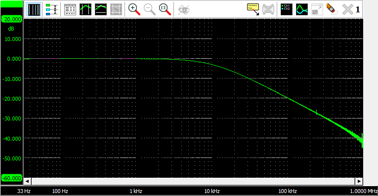
When a graph contains frequency domain data (spectrum analyzer), the horizontal frequency axis can be set to two different types:
- Linear: The spectrum is shown on a linear frequency scale. The frequency axis runs from 0 to the maximum frequency and has a linear division.
-
Logarithmic: The spectrum is shown on a Logarithmic frequency scale.
The frequency axis runs from the minimum frequency to the maximum frequency and has a logarithmic division.
Setting the axis type can be done by clicking the  Linear axis button or
 Logarithmic axis button or by right clicking the axis and selecting "Axis type" from the menu that pops up.
Time axis label style
The label style of a time axis can be set to three different styles:
-
Seconds: All labels along the axis display the time in seconds.

-
Days, hours, minutes and seconds: The labels along the axis display the time in seconds.
When the label time exceeds 1 minute, the time for that label will be displayed in minutes and seconds.
When the label time exceeds 1 hour, the time for that label will be displayed in hours, minutes and seconds.
When the label time exceeds 1 day, the time for that label will be displayed in days, hours, minutes and seconds.

-
Date and time: The labels along the axis display the time in absolute date and time.

When the graph contains the output of a Crankshaft Angle I/O or phase cursors are enabled, the horizontal axis can also be set to a fourth style:
-
Degrees All labels show the angle in degrees or percent, depending on how the phase cursors are set.

To set the label style, right-click the horizontal axis and select the menu item Label style.
Toolbar

 Enable/disable a time=0 line in Yt mode
- Toggle between linear and logarithmic frequency axis in spectrum analyzer
- Arrange the axes vertically
 Enable/disable cursor value window
 Enable/disable vertical cursors
 Enable/disable horizontal cursors
 Reset horizontal and vertical cursors to 25% and 75% of screen
 To zoom in, drag a rectangle in the graph
 Undo the last zoom operation (hotkey: U)
- Zoom out to full scale, horizontally and vertically (hotkey: Shift + U)
 Clip data collector(s) to visible part
 Show/hide reference signals
 Update reference signal with live data
 Add a comment to the graph
 Remove all comments from the graph
 Show legend
 Yt or XY mode
 Move graph to new window
 Restore graph in main window
 Delete all axes (hotkey: Ctrl + Del)
 Close this graph
 Graph number
Zooming
If you want to view a small section of your measurement simply drag a rectangle using the mouse at the section you
want to see in detail, see animation 9.
Multiple mouse zooming operations are remembered and it is possible to unzoom with the
Undo zoom button
or hotkey U.
Fully resetting all horizontal and vertical axes is done with the
Reset zoom button.
To zoom in horizontal direction only and leave the vertical zoom factor unchanged, press the Ctrl key and select a zooming area with the mouse. To zoom in vertical direction only and leave the horizontal zoom factor unchanged, press the Shift key and select a zooming area with the mouse.

Zooming in horizontal direction only is also possible using the mouse wheel. Wheel up causes the graph to zoom in horizontally, around the location where the mouse is positioned. Wheel down causes the graph to zoom out horizontally, around the location where the mouse is positioned.

When zoomed in, the graph can then be panned horizontally by dragging the signal left or right, with the right mouse button pressed.
Zooming using keyboard controls
Horizontal zooming and panning is also possible using hotkeys. The following hotkeys affect the horizontal zoom factor of the active graph:
| Hotkey | Function |
|---|---|
| Ctrl + → | Zoom horizontaly in from the left side of the graph, in fixed steps |
| Ctrl + ← | Zoom horizontaly out at the left side of the graph, in fixed steps |
| ↑ | Zoom horizontaly in from the right side of the graph, in fixed steps |
| ↓ | Zoom horizontaly out at the right side of the graph, in fixed steps |
| ← | Pan to the left, in fixed steps |
| → | Pan to the right, in fixed steps |
| T | Reset to the total full record view |
Zooming in and out in a graph affects the horizontal visible range and vertical visible range of the axes.
Drawing options
Several drawing options are available via the graph popup menu, which is shown by right-clicking a graph.
Interpolation
When the number of pixels in the graph is larger than the number of displayed samples, two different ways of drawing the signal are available:
- Interpolation on: straight lines are drawn through the samples
- Interpolation off: a staircase line is drawn along the samples.
Visual noise reduction
The Visual noise reduction setting reduces some of the noise that may appear while drawing the measurements in the graphs. The result is smoother and thinner lines.
Show t=0
An oscilloscope graph in Yt mode can show a vertical line at t=0. The option Show t=0 enables and disables this feature.
Legend
Using the option Show legend a legend of the shown signals is drawn in the upper left corner of the graph.
Markers
Using the option Show markers, each graph additionally gets small markers on the line. For each line a different symbol is used. These can be helpful in distinguishing signal lines, particularly when lines have (nearly) the same color.
Automatic measurements using the cursors
In each graph, vertical and horizontal cursors can be used to indicate certain parts of the graph. The cursors can be individually enabled by:
-
using the
Show vertical cursors button on the toolbar
-
using the
Show horizontal cursors button on the toolbar
- clicking Show vertical cursors in the graph's popup menu.
- clicking Show horizontal cursors in the graph's popup menu.
The cursors can also be used to measure values of interest indicated by the cursors. These measurements include e.g.: Mininum, Maximum, Top-Bottom, RMS, Mean, Variance, Standard deviation, Frequency.
Measurement results are shown in a special cursor value window which is opened by clicking the
Cursor value window button on the toolbar.
When the cursor value window is opened and the vertical an/or horizontal cursors are not switched on,
the required cursors will be switched on, based on the default selected measurements.
Vertical cursors are waveform based, they can be positioned anywhere on the signal by dragging them with the mouse. Optionally, they can snap to sample positions, by selecting Snap vertical cursors to samples from the graph's popup menu. Two red lines in the time axis scroll bar represent the vertical cursor locations in the record. To position both vertical cursors simultaneously and keeping them at the same distance from each other, press the Ctrl key while dragging a vertical cursor.
Horizontal cursors are graph based, they can be positioned anywhere in the graph by dragging them with the mouse. To position both horizontal cursors simultaneously and keeping them at the same distance from each other, press the Shift key while dragging a horizontal cursor.
Due to zooming, cursors can become off screen.
To position an off screen cursor, it can be grabbed at the edge of the screen.
The mouse pointer will change shape to indicate that the cursor can be dragged.
Off screen cursors can be positioned inside the screen again by clicking the
Cursor reset button which will position all cursors at 25% and 75% of the visible screen.
A horizontal and vertical cursor can be positioned simultaneously by dragging the intersection of the two cursors. Using the Ctrl key and/or the Shift key, the other cursors can be positioned as well, maintaining their distance to each other.
Measurements
For clarity, not all measurements are enabled by default when the cursors are enabled.
In the program settings ( ) can be determined which measurements are default shown when the cursors are enabled.
The cursor window will by default look like in the figure below.
) can be determined which measurements are default shown when the cursors are enabled.
The cursor window will by default look like in the figure below.
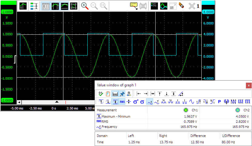
The measurements Left, Right, Right-Left, Top, Bottom, Top-Bottom and Slope require the vertical and/or horizontal cursors to be enabled. They use the cursor positions for their result.
All other measurements are calculated over a data range. When the vertical cursors are enabled, the data range is marked by the vertical cursors. When the vertical cursors are off, the data range equals the post samples.
Besides the calculated values in between the vertical cursors, the positions of the vertical cursors,
as well as the difference between them, can be seen at the bottom of the cursor window.
The  Show base info button hides or shows this base info.
A user configurable virtual impedance is available that is used by the Power measurement
 and the dBm measurement
 .
Cicking the
.
Cicking the  Impedance button will allow to set its value.
Its default value is 600 Ω.
Impedance button will allow to set its value.
Its default value is 600 Ω.
The measured values can be copied to the clipboard as text, by pressing the
 Copy to clipboard button.
When Always on top is switched on with the  Always on top button, the cursor window cannot be hidden under other
windows of the Multi Channel oscilloscope software.
Always on top button, the cursor window cannot be hidden under other
windows of the Multi Channel oscilloscope software.
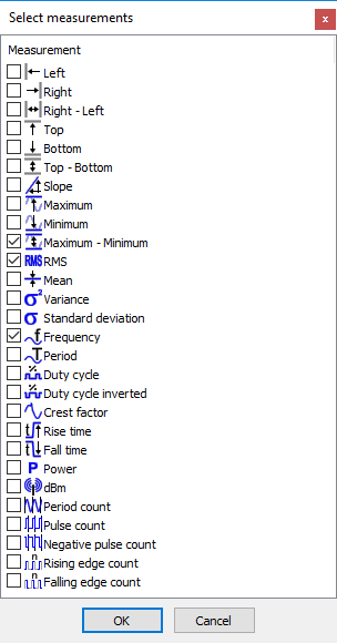
Enabling or disabling measurements can be done by clicking the corresponding measurement buttons on the toolbar,
by clicking Select measurements... in the popup menu of the cursor window, or by clicking the
 Select measurements button on the toolbar.
A window as depicted below will popup, in which the desired measurements can be selected.
Select measurements button on the toolbar.
A window as depicted below will popup, in which the desired measurements can be selected.
Note: For the frequency measurement, at least one cycle must be in between the vertical cursors. Furthermore, at least two rising slopes must be present in the signal.
Phase cursors
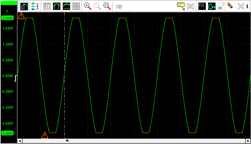
When examining phase shift between signals, or examining other periodic signals like e.g. crankshaft signals, special Phase cursors can be switched on in the graph. Right-click the graph and select Phase cursors from the popup menu to enable the phase cursors.
With these special cursors, the beginning and end of a cycle can be marked, which then is considered to be 0 to 360 degrees. It is also possible to mark that area as being 0 to 720 degrees, 0 to 100 % or some user defined range. The regular cursors can then be used to determine the angle of a specific position in the cycle. This angle is determined using linear interpolation between the two limits of the range.
Optionally, the horizontal axis can be set to show the angles instead of time. And overlays can be drawn over the graph to divide the selected range in e.g. 4 sections, for easy visual recognition.
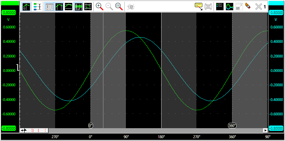
In the image above, two sine waves with a phase shift are measured, where the phase cursors are placed on the beginning and end of one period of the Ch1 signal. The horizontal axis is set to show degrees. The left hand side normal cursor is placed at the zero crossing of the Ch2 signal.
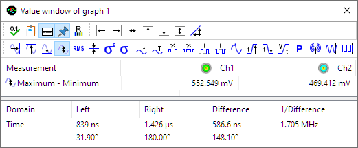
The cursor readout shows the phase cursor information in the bottom row of the window. It shows that the phase angle for the left cursor, positioned at the start of a cycle on Ch2, is at 31.9 degrees, the phase angle between the two signals. The right cursor is placed half way the ch1 signal, at 180 degrees.
Phase cursor settings
Right-clicking the graph and selecting Settings for the phase cursors... will open the Phase cursor settings window.
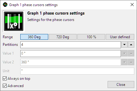
The following settings are available:
-
Range determines the range of the section that is defined by the two special phase cursors:
- 360 deg the range covers 360 degrees, the left phase cursor marks 0 ° and the right phase cursor marks 360 °.
- 720 deg the range covers 720 degrees, the left phase cursor marks 0 ° and the right phase cursor marks 720 °.
- 100 % the range covers 100 percent, the left phase cursor marks 0 % and the right phase cursor marks 100 %.
- User defined a user defined range can be set. This uses the settings Value 1, Value 2 and Unit.
- Partitions determines in how many partitions the range is divided. The time axis will get one label per partition and the partitions will be marked in the graph with a slightly different background color.
- Value 1 sets the left hand side limit of the user defined range. This value can be higher than the right hand side limit.
- Value 2 sets the right hand side limit of the user defined range. This value can be lower than the left hand side limit.
- Unit sets the unit for the user defined range.
Reference signals
You can create a reference to any signal that is displayed in a graph. A reference is a copy of a signal. It is filled and then remains unchanged while measuring. By making such a copy and continuing measuring, you will be able to see differences between the life signal and the reference. References can also be loaded with a "known good" signal of a device, to check life signals against this "known good" signal while troubleshooting a system.
You can create a reference by choosing in the popup menu of the graph or one of its axes.
This creates the reference signal and adds it to the same axis as its original.
When the reference is created, an Update reference button is added to the graph's toolbar
which can be used to copy new data from the life signal into the reference.
Multiple references can be made to a signal.
References can be temporarily hidden from the graph.
The  )
Show references button toggles the visibility of the available references.
)
Show references button toggles the visibility of the available references.
Using comments
Sometimes it is clarifying to add a text comment to a graph, to explain certain phenomena in the measured signals. An unlimited amount of comments can be added to each graph and an unlimited amount of arrows can be drawn from each comment to point at the signals.
A comment can be added by:
-
using the
Add comment button on the toolbar
- clicking Add comment in the graph's popup menu.
- Pressing the Space bar when performing a streaming measurement and a Data collector is shown in the graph.
When performing a streaming measurement and a Data collector I/O is shown in the active graph, pressing the Space bar will add a comment to the active graph, at the time location corresponding to the current time. The comment will contain the text Trigger and a serial number, 1 for the first one that is placed, 2 for the second one that is placed, etc. This can be used to mark specific moments during the streaming measurement.
To edit the text of a comment, right-click the comment and select Comment... from its popup menu.
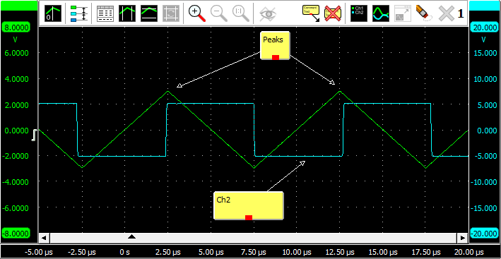
The comments can be dragged to the desired position. Arrows can be created by "dragging" from the little square at the middle of the bottom of the comment to the desired position. You can move an existing arrow by dragging its point to a new position. Multiple arrows can be drawn on a comment. To move a comment including its arrow, press the Ctrl key while dragging the comment. To delete an arrow, right-click on its point and click Delete.
An existing comment can be cloned, to get a copy with the same properties. Cloning can be done on just the comment itself, but also on the comment including its arrows. Cloning is done via the popup menu of the comment.
A comment can be deleted by:
- clicking Delete in the comment's popup menu.
- clicking Remove all comments in the graph's popup menu.
- using the
Remove all comments button on the toolbar
Exporting graph data
The data displayed in a graph can be exported to one or more files. All data of all shown lines will be exported. Lines that are added to the graph but are hidden, will not be exported. When cursors are switched on, only the data in the section between the two cursors will be exported.
To export the data in a graph, right click the graph and select Export data... from its popup menu.
A standard save dialog will popup, which is extended with options for the selected file format.
With the file type combo box in the dialog, the desired file type can be selected. The list of available file types depends on the sources that are present in the graph. For example, most formats only support one time base. If sources with different time bases are selected, a separate file per source will be exported. The file name of the exported file will then also contain the name of the corresponding source.
Saving Graphs
A graph with data, comments and cursors can be exported in graphical way to an image file. This is explained on the page on saving images.